
Colour meanings and psychology – which colours should you choose for your brand?
The colours you choose for your brand matter: they influence the impression you make, how much people trust you and what visitors click on. In this article, I explain what different colours can communicate and how to use them on your website or within your brand identity.
Colours work best within a brand identity when they are not isolated decorative elements, but part of a consistent visual system alongside your logo, typography, web design and graphic materials.
In brief: if the design looks “nice” but something still isn't working (too few clicks or enquiries), the answer often lies in colour contrast, a hierarchy or the CTA and the colours used for calls to action — not in “adding more graphics”.
What is colour psychology?
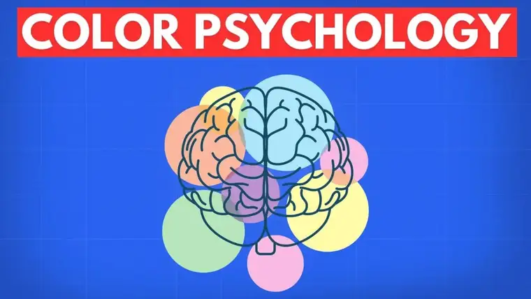
A colour psychology explores what kinds of emotions, associations and behavioural responses different colours may evoke. In design, that matters because colours can do some of the work for you: they help visitors quickly understand what matters and what to do next, such as click, contact you or buy.
What do different colours mean in marketing and branding?
Every colour has its own common psychological associations. These are not hard-and-fast design “rules”, but a useful guide: context such as industry, audience and tone matters a great deal. Here are some of the most common associations:
- Blue – trust, stability and expertise (common among service providers and in finance and technology)
- Red – energy, urgency and attention (calls to action, promotions and strong highlights)
- Green – nature, calm and balance (wellness, health and sustainability)
- Yellow – optimism, openness and creativity (for drawing attention, with sufficient contrast)
- Orange – energy, approachability and activity (for friendly, energetic brands)
- Purple – creativity, individuality and a premium feel (in beauty, culture and personal branding)
- Black / dark tones – elegance, premium positioning and confidence
- White / light tones – cleanliness, simplicity and an open, modern look
The key is the intentional use: the same colour can communicate something completely different when its surroundings change — background, typography, imagery and message all matter.
Colour choices become stronger when you treat them as part of the whole brand system rather than isolated decisions. If you do not yet have a consistent visual foundation, the step-by-step brand identity guide shows how your logo, typography, colour palette and imagery work together.
2. Colour combinations and harmony
Colours work together as a system rather than one at a time. A harmonious palette creates a more professional impression and prevents the page from feeling disjointed.
- Complementary colours: strong contrast (effective for calls to action, but easy to overdo)
- Analogous colours: a calm, harmonious effect (great for brand-focused interfaces)
- Monochromatic palette: a clean, cohesive look (with good contrast and hierarchy)
Choosing a palette is always a strategic decision in web design and branding projects: poor contrast or too many competing, loud shades can reduce conversions, while a carefully considered visual system builds trust.
3. Colours and visual hierarchy
Colour is one of the strongest tools for establishing visual hierarchy. The goal is to guide the visitor's eye naturally towards what matters.
- Primary call-to-action buttons with a brighter, more contrasting colour
- Important words, headings and labels with colour highlights (used sparingly)
- Background-to-text contrast for readability (especially on mobile)
This is especially important on a website: colours do more than establish a mood; they also guide the click path and key decisions. If your site looks good but does not generate enough enquiries, read the article on common web design mistakes is.
4. Colours and brand identity
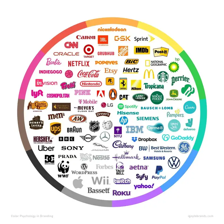
Brand colours make your business instantly recognisable. They work best when they are not just “pretty” but used consistently.
- A consistent palette across every channel (website, social media and materials)
- Consistent use of colours in logos, buttons and icons
- Consider the target audience's preferences (alongside expectations in your industry)
Not sure which colours suit your brand?
A palette works best as part of a complete brand identity system. If you want your colours to do more than look good and also support building trust, recognisability and conversions, I can help you turn your visual presence into a coherent system through brand identity design.
Quick checklist (2 minutes)
- Do your call-to-action buttons have enough contrast and look clickable?
- Is the text readable on mobile (contrast, size and background)?
- Are there no more than one or two dominant colours, with the rest used as accents?
- Does the palette suit your target audience and price positioning?
- Are your website and social media colours consistent?
For online stores, the colour palette also affects how customers interpret product cards, promotions, call-to-action buttons and trust-building elements. Read more in the article on online store structure you can read more.
FAQ
Is there a “perfect” colour for an industry?
There is no universally correct answer. Some patterns are well established (such as blue being associated with trust), but the most suitable palette always depends on your brand positioning and target audience starts from.
How many colours should a website use?
Generally, one or two main colours, one accent colour for calls to action and neutral tones (grey, white and dark shades) are enough. Too many dominant colours dilute the focus.
What makes a good colour for a call to action?
It contrasts with the background, consistently signals an action and does not compete with other elements using the same strong colour.
Summary
A colour psychology is not merely decoration: the right shades and combinations can improve the user experience, guide attention and reinforce your brand message. A well-designed colour palette is a strategic tool in effective design.
If you want your colours to work for your business as well as look good, get in touch.
Planning a website?
The checklist helps you identify what content, images, brand assets and trust-building elements you may need before commissioning a website.