
What is an online store? Structure, shopping and trust
An online store works well when it does more than present products attractively. It helps visitors choose quickly, trust the brand and complete a purchase easily.
Brand identity and web design matter particularly in an online store: customers often decide within seconds whether they trust the brand, understand the range and want to continue shopping.
An online store's structure is not simply a design issue. The logic of its categories, product-page content, trust signals, mobile usability, cart, payment process and how well search engines understand the content all matter.
In brief: a good store does not work because it has a large number of products. It works because customers can easily find what they want, understand a product's value, trust the site and place an order without unnecessary obstacles.
What is an online store?
A The meaning of an online store is simple: it is a digital sales platform where visitors can learn about products or services, select them, add them to a cart and place an order or make a payment. Another common English term is e-commerce website.
An online store is more than a digital product list, however. It manages the complete shopping journey: searching and choosing categories, comparing products, the cart, delivery and payment details, order confirmation and often post-purchase communication.
A Online shopping is comfortable when visitors understand at every stage where they are, how much they will pay, when the product will arrive and what happens if something goes wrong. Good store structure is therefore a combined design, content, technical and business challenge.
Why does online store structure matter?
Visitors to an online store do more than browse. They decide which product suits them, whether the site is trustworthy, whether the price is fair, what shipping costs, whether returns are possible and how easy ordering will be.
If the site does not answer these questions quickly, customers can easily lose confidence. The goal of its structure is therefore to guide visitors through the purchasing journey, from search and product understanding to adding items to the cart and paying.
A striking homepage alone is not enough in online store design. Results often depend on the details: product cards, filters, photos, descriptions, trust signals, buttons and forms.
1. Homepage: a guide, not a poster
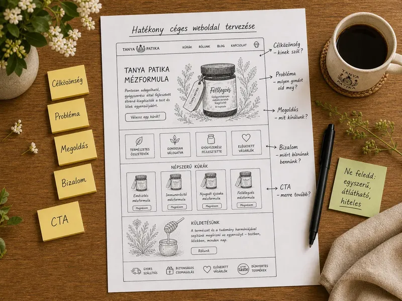
The homepage often creates the first impression, but it does not need to say everything at once. Instead, it should help visitors quickly move towards the products relevant to them.
A good online store homepage usually includes:
- a clear brand promise – what you sell and what makes it different;
- main product categories – so visitors can choose a direction quickly;
- featured products or bestsellers – if you already have a strong range;
- trust-building elements – shipping, warranty, customer reviews and authenticity;
- visible calls to action – such as “View products” or “Choose a category”.
A good homepage guides rather than overwhelms. Visitors should not have to search for the next step; they should arrive there naturally.
2. Category pages: help people choose
Category pages are among the most important parts of an online store. Here, customers are interested in a type of product but still need to choose. A category page should therefore help people make decisions, not merely show a product list.
Useful category-page elements include:
- a short category introduction that explains which products are included;
- clear product cards with good images, names, prices and concise information;
- filters and sorting when there are several products;
- highlights such as new, popular or recommended products;
- natural internal links to related categories or guides.
Category pages also matter for SEO because many shoppers search for a product type rather than a specific product name. A well-written, structured category page can help attract more relevant visitors.
3. Product pages: where purchase decisions are made
The product page is one of the most critical points in the store. Visitors are close to buying but still want answers: what exactly will they receive, how can they use it, who is it for, how much does it cost, when will it arrive and what if it is not right?
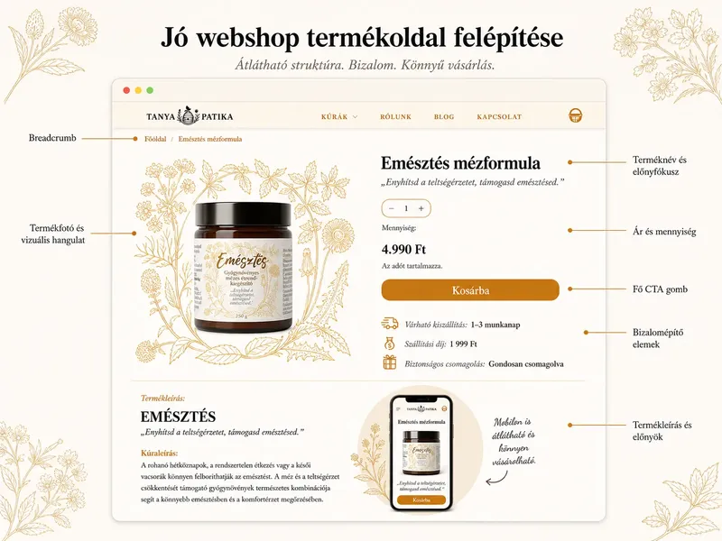
A strong product page should include:
- high-quality product images from different angles or in real-life settings;
- a clear product name rather than just an internal product code;
- a concise, benefit-led description with the essential information;
- price and stock information presented clearly;
- shipping and returns information in an easy-to-find place;
- a prominent purchase button for example, “Add to cart”;
- related products when they help customers choose.
Avoid overly generic product descriptions. “Excellent-quality product” is not enough. Explain what the product does, who it suits, which problem it solves, what its benefits are and why it fits the customer's situation.
4. Building trust: why should customers feel safe ordering?
Trust is particularly important in an online store because customers often pay in advance without seeing or trying the product in person. The website therefore needs to address common uncertainties.
Trust-building elements in an online store include:
- authentic product photos or a carefully designed, consistent visual presentation;
- detailed product information including dimensions, ingredients, materials or specifications;
- delivery times and fees explained clearly;
- returns and exchange terms that are easy to find;
- contact information, so customers know whom to contact;
- customer reviews, if available;
- a consistent brand identity that creates a more professional and credible impression.
Building trust is not just a matter of legal information. Design, copy, photography, product data and the purchasing process work together to make a store feel like a real, dependable brand.
If your brand identity is not yet consistent, the store can also make a weaker impression. I explain this further in the step-by-step brand identity guide. The role of colour palettes and contrast is covered in the article on colour meanings.
5. Mobile shopping: simplicity matters even more on small screens
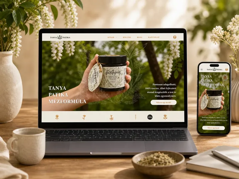
On mobile, an online store needs to be faster, simpler and clearer because space is limited, attention spans are shorter and every awkward step can interrupt a purchase.
Particularly important on mobile are:
- large, easy-to-tap buttons;
- short, well-structured product descriptions;
- a clear cart icon and cart status;
- quick access to filters and categories;
- a limited amount of useful information at once;
- comfortable forms during checkout.
A mobile store cannot simply be a miniature desktop site. Customers need an interface that lets them browse, choose products and order comfortably through touch interactions.
6. Cart and checkout: minimise friction
The cart and checkout are where the priority is no longer persuading customers but avoiding losing them. Every distracting element, unnecessary field, hidden cost or unclear detail can increase the likelihood of cart abandonment.
Good checkout principles include:
- visible order totals and shipping information;
- as few required fields as possible;
- clear payment and delivery options;
- guest checkout where appropriate;
- visual and written cues that build confidence;
- understandable form error messages.
Many stores lose customers at the end of checkout rather than on product pages. Checkout UX is therefore a business concern as well as a design issue: the less friction, the more likely customers are to complete their orders.
If you are unsure what level of store or website you need, the article on website design pricing can help you think through the options.
Planning an online store or product page?
If you want an online store that guides customers to your products clearly as well as looking attractive, I can help you plan its structure, visual design system and shopping journey.
7. Online store SEO: make it discoverable, not just attractive
SEO for an online store is not only about blog articles. Product pages, categories, product names, descriptions, images, internal links, structured data and technical foundations together determine how well search engines understand the site.
Key SEO elements for online stores:
- unique product descriptions rather than only standard manufacturer copy;
- descriptive category pages with a short introduction and logical product list;
- a good URL structure with understandable category and product names;
- optimised images with suitable filenames, sizes and alt text;
- Product structured data on product pages where prices, stock, reviews or offers are available;
- Merchant Center feed when products can appear in Google Shopping or free listings;
- internal linking between categories, products and guide content.
Structured data cannot replace a good product page, but it can help search engines interpret product information more accurately. The data must be real, up to date and consistent with what visitors see on the page. I share actual organic search figures in the article on real Google Search Console SEO results, including an anonymised Shopify project.
If you want to see how this works in a real project, the Shopify store case study uses anonymised data to show why product structure, basket value, the shopping journey and trust-building design matter.
When planning a store, consider the pricing and development scope as well. You may find the article on website design pricing is.
useful.
Common online store mistakes
- Many stores underperform not because the products are poor, but because the site does not support choosing and buying well enough. Good design here is not decoration; it helps people make decisions. An overcrowded homepage:
- everything competes for attention and there is no clear direction. A weak product description:
- it does not explain whom the product suits or why it is useful. Too few or poor-quality product photos:
- customers cannot picture what they will receive. Hidden shipping information:
- the final total or delivery time becomes clear too late. Missing trust signals:
- no contact details, reviews, warranty or returns information. An awkward mobile interface:
- Complicated checkout: small buttons, difficult filters and long forms.
- Unnecessary fields, forced registration or unclear errors. Copied product descriptions:
less useful for SEO and brand differentiation than unique content. These problems also occur in general web design, but their business impact is more direct in an online store: instead of postponing an enquiry, the customer abandons an actual order. I also discuss this in the article on web design mistakes
.
Quick online store checklist
- If you run a store or are planning one, go through this list:
- Can visitors tell what you sell and whom it is for within seconds?
- Are the categories logical and easy to understand?
- Do product cards show the name, price and essential information?
- Does the product page answer customers' most important questions?
- Are there high-quality product photos or lifestyle images?
- Are shipping, returns and contact details visible?
- Is the “Add to cart” button obvious and easy to find?
- Is searching and ordering comfortable on mobile?
- Does checkout avoid asking for unnecessary information?
Are product pages unique and structured for SEO?
If you answered “no” to several questions, you may need more than a visual refresh: a more considered store structure and shopping journey could help. If your store looks impressive but generates few enquiries or purchases, it is worth reviewing the problem from a broader web design perspective. The.
FAQ
What is an online store?
article on 7 common web design mistakes
An online store is a digital sales platform where visitors can discover products or services, select them, add them to a cart and order or pay for them.
What matters most in an online store's structure?
The priority is for customers to quickly understand what you sell, why the store is trustworthy, how to choose and how to order easily. The design, copy, categories and checkout all work together.
Does every online store need separate category pages?
If you sell several product groups, yes: separate category pages make choosing easier and provide a clearer structure for SEO.
What makes a product page trustworthy?
Does mobile store design matter?
Good product images, clear descriptions, accurate pricing and stock information, shipping and returns terms, customer reviews and an obvious purchase button.
Yes. On mobile, navigation, product cards, cart, forms and checkout need to be especially simple. If mobile shopping is awkward, customers can easily abandon their orders.
Is an attractive design enough for an online store?
No. Appearance matters, but it is not enough on its own. A store works well when design supports decision-making, product information is clear, trust signals are visible and the purchasing process is simple.
Summary
A good online store does more than display products: it supports purchasing decisions. The homepage offers direction, category pages help people choose, product pages build confidence, trust signals reduce uncertainty, and the cart and checkout guide customers through the order without obstacles.
The most effective online stores are not necessarily the most complex. They communicate clearly, use an understandable structure, work comfortably on mobile and answer customers' questions at the right time. The Office Art & Design Shopify store case study
also shows how a more premium, structured Shopify store brings together product cards, categories, product pages and trust-building elements. get in touch.
Free resource
Planning a website?